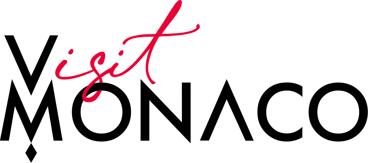
Monaco’s tourism authority has unveiled a new visual identity for Visit Monaco, combining Art Nouveau-inspired typography with contemporary design elements in a rebrand aimed at reinforcing the destination’s international appeal.
The Direction du Tourisme et des Congrès de Monaco presented the renewed identity last week, describing it as “heritage in motion” and designed to capture both the Principality’s longstanding prestige and its forward-looking character.
Contrasting design elements
The new logo centres on two distinct typographic treatments. “Monaco” appears in Art Nouveau-inspired lettering, intended to convey timeless prestige and global recognition. “Visit” uses a handwritten style, introduced to suggest approachability and personal connection.
The visual system employs geometric principles to maintain consistency across digital and print applications, according to the tourism authority.
Monogram and business tourism variant
A new monogram accompanies the wordmark, designed as a contemporary interpretation of Monaco’s heraldic traditions. The emblem can be used independently in certain contexts, providing flexibility for different communication needs.
The tourism authority has also developed a Convention Bureau version of the identity to distinguish its business and professional events offering while maintaining visual alignment with the main brand.
The updated identity is intended to strengthen Visit Monaco’s positioning and improve engagement with leisure travellers, tourism professionals and event organisers.
Stay updated with Monaco Life: sign up for our free newsletter, catch our podcast on Spotify, and follow us across Facebook, Instagram, LinkedIn, and Tik Tok.
